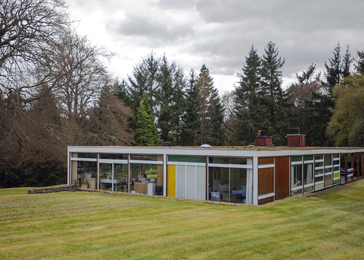
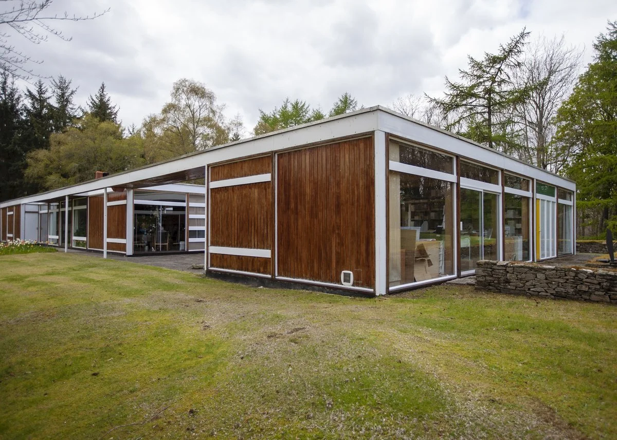
High Sunderland
Designed by Peter Womersley in 1972 for Bernat Klein, photo © Michael Smith, 2016
When Sir Basil Spence was President of the RIBA he was asked which he thought was the best modern house in Britain. He replied: ‘Any house designed by Peter Womersley’.
Manser, M. ‘Peter Womersley: Architect’, Home, August 1960, pp.18-21.
Richard Brook is an Architect and Reader at the Manchester School of Architecture
Richard Brook's interest in Peter Womersley's buildings was sparked by a chance encounter with Farnley Hey near Huddersfield.
High Sunderland (1955-58), designed by Peter Womersley for textile designer Bernat Klein (let us call them Peter and Bernat from this point forward in recognition of their personal friendship) and his family near to Selkirk, is an enduring piece of post-war modernism that is fabled by virtue of its relative obscurity and its architectural quality. It is referred to as a piece of California in Scotland and clearly owes much to the Case Study Houses.
It has also been described as a ‘Mondrian set within a Klimt’, which acknowledges the artistic sensibility of both the architect and his clients.
Klein, S. (2020) 'The See Through House', London: Random House, p.5.
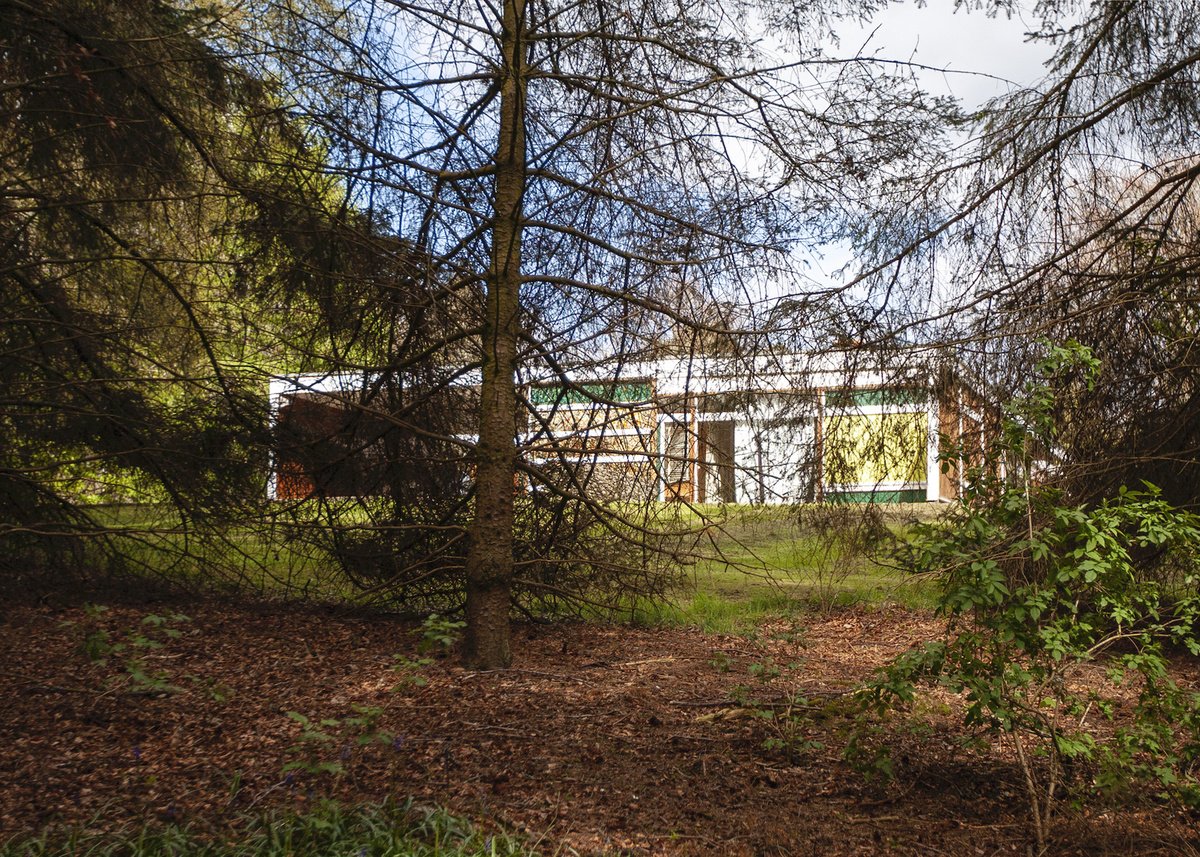
High Sunderland viewed from the path between the house and the studio, Michael England, 2012
I was lucky enough to visit Bernat Klein at his home in 2012 where Bernat and his daughter, Shelley, kindly received me with a few friends. We were on a day trip to the Borders to see as much of Peter Womersley’s work as we could in one day. I have interviewed another home owner who knew Peter personally, but didn’t want to commission a house from the architect due to an alleged wilfulness in the pursuit of style over function. [This referred to a particular threshold detail at the Heald House in Didsbury in Manchester built in 1964.]
Knowing this I asked Bernat whether he had much input into the design of High Sunderland, or any disagreements with Peter over such matters. Bernat responded with a resolute ‘no’ on both counts, referring to architecture as art and implying that he had no right to inhibit another artist’s work. He and wife Margaret commissioned Peter in 1955 after they ‘had seen and liked the house which Peter had built for his brother John at Farnley Hey near Huddersfield and briefed him to plan our house on similar aesthetic lines but on one level’. [Extract from partial manuscript by Joe Blackburn, Peter Womersley’s business partner between 1962 and 1970. MMU Special Collections.]
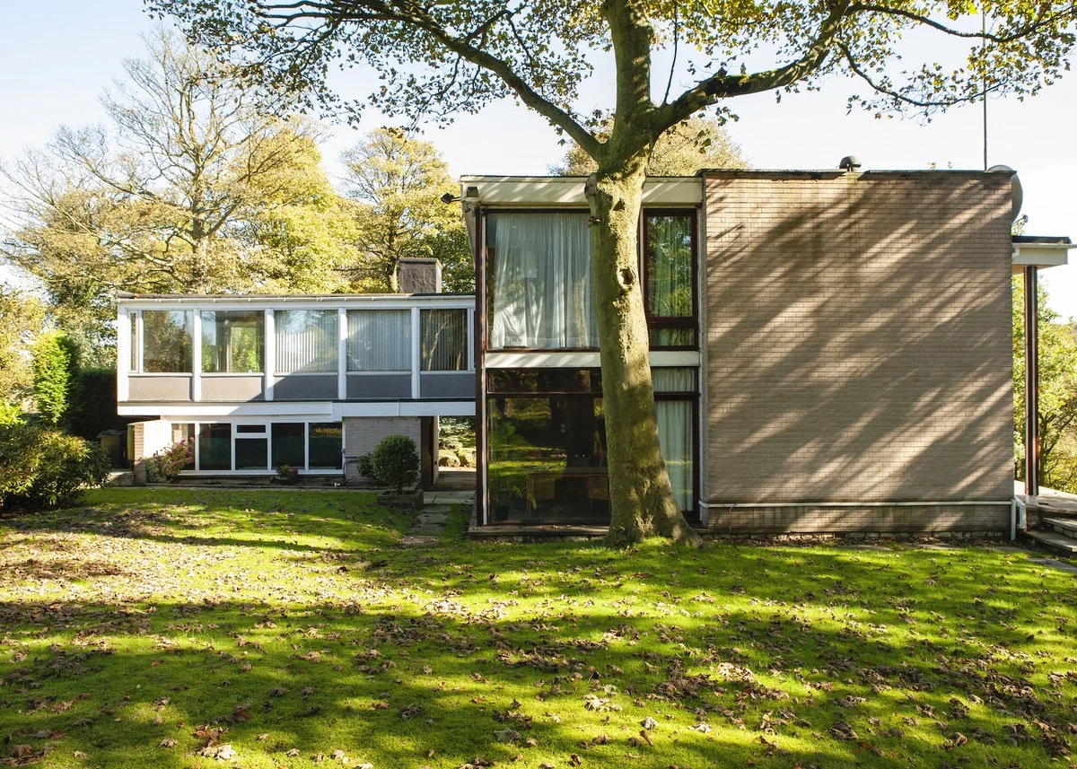
Farnley Hey, Richard Brook, 2010
The artistic freedom given to Peter was attested to by Michael Laird, who wrote in 1959 that, ‘the architect was asked to design a comfortable house for a family of five … and very little further briefing was ever given’; in turn, it is evidenced by the reporting that ‘not even cost was discussed seriously, either before or during the project, and no definite cost figures are available’. [Laird, M., ‘Two Scottish Houses’, The Architects’ Journal, 1 January 1959, pp.29-34. Later Laird helped and encouraged Bernat in the production of his 1976 book, Design Matters.]
My own impression of the older Bernat Klein was that he was every bit the ‘completely contented customer’ referred to in 1959. Thirty five years later, he and wife Margaret considered that ‘the many, everyday, practical advantages which the house offers are important to us but probably not as decisive, as regards our attachment to it, as the constant visual pleasures we enjoy; these are as fresh and intense as they were when we first moved in.’
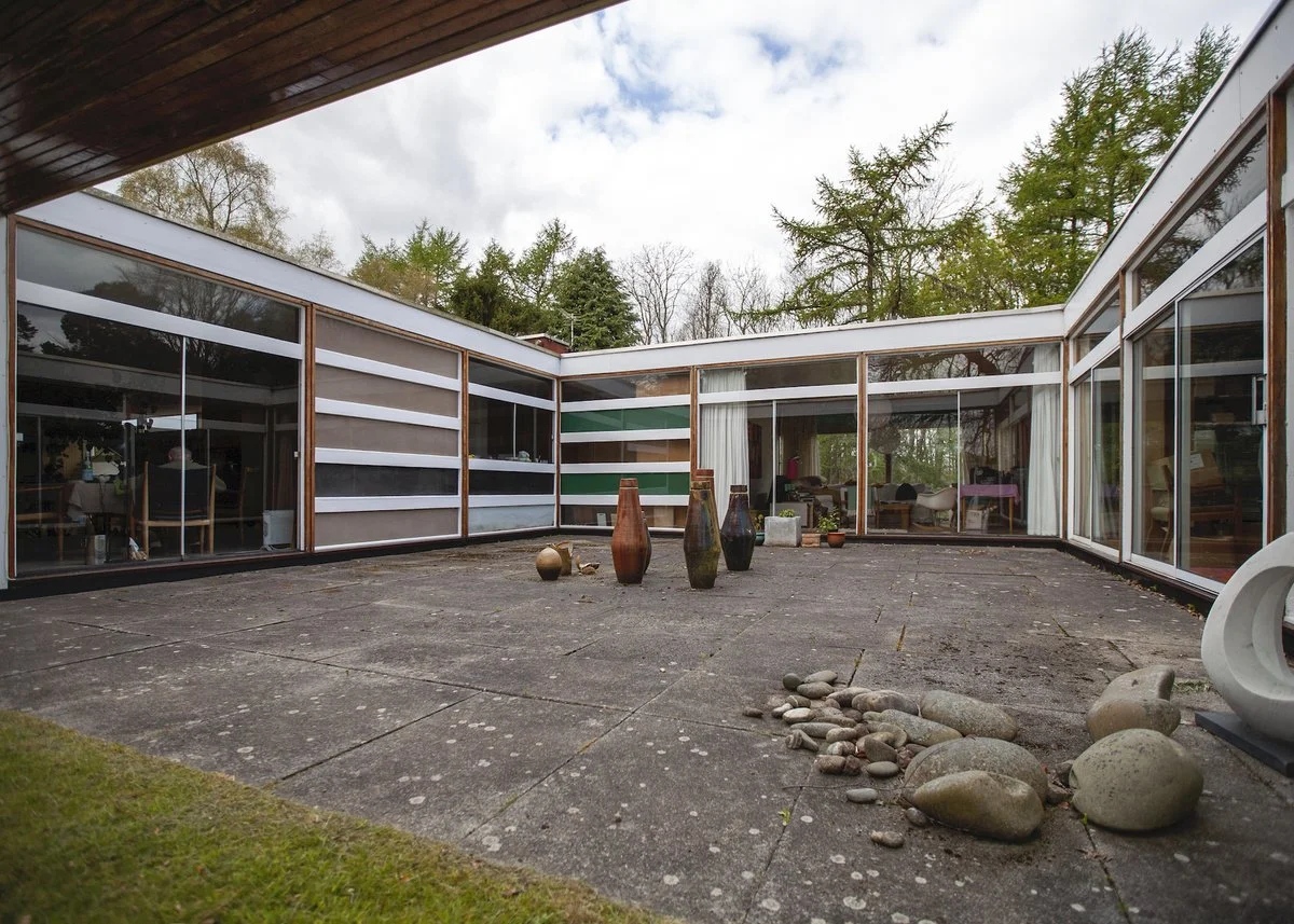
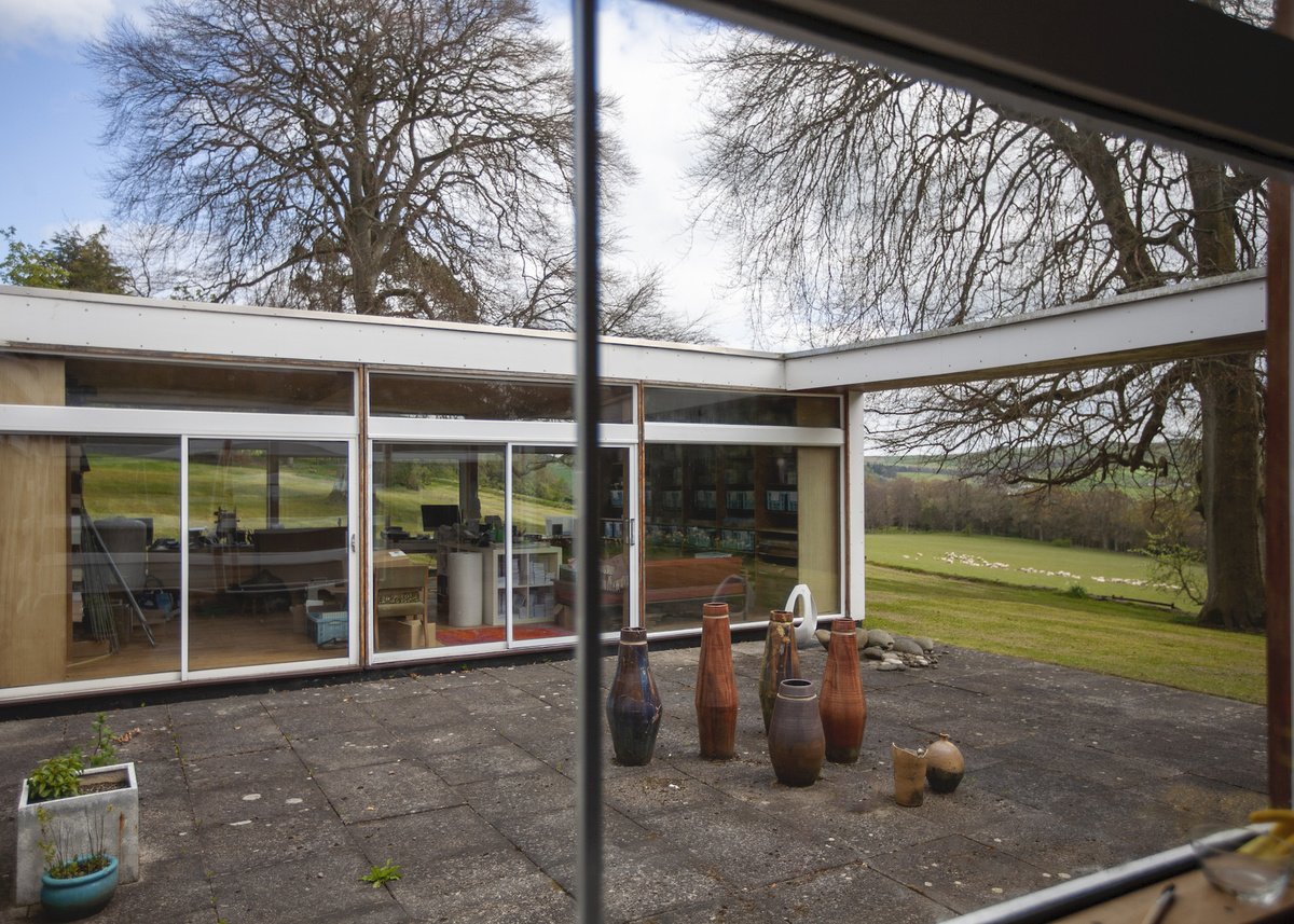
View of South-East courtyard with Bernat just visible sitting at the dining room table in the window on the far left, Michael England, 2012
In the house Bernat was said to be ‘very much at one with his surroundings’ and to find ‘the ever changing views … a constant source of inspiration.’
Welton, A. ‘Bernat Klein: A Man of Many Colours’, Cumbria Lakeland and the Borders, July 1966, pp.168-173.
However Shelley tells of his overriding concern for nature to harmonise with the house tonally, 'even if it meant cleaning green moss from the bark of silver birch trees!' Bernat Klein was an artist first and an industrialist second, but this did not inhibit his business success. He studied textile technology at Leeds University and, following jobs in Bolton and Edinburgh, he established his own mill in Galashiels in 1951.
In 1952 his business took off as he began supplying Woolworth’s and Marks and Spencer’s with scarves. By 1966 his firm employed over 600 people as he drew inspiration for new cloths and patterns from the Border countryside citing the colours of the seasons and their blurring and the transformation of natural hues as ‘breathtaking’. Eventually, most of the mill’s production was focused on two collections a year for the couture trade in London and Paris – Chanel first used his textiles in 1963. Both the textures and the colours that are framed from the interior of the house are clearly evident in the cloth made by Bernat Klein Design.
Colour was a preoccupation for Bernat. In the introduction to his 1965 book, Eye for Colour, he asserted that ‘clothes and colour are at least as important as food and drink!'
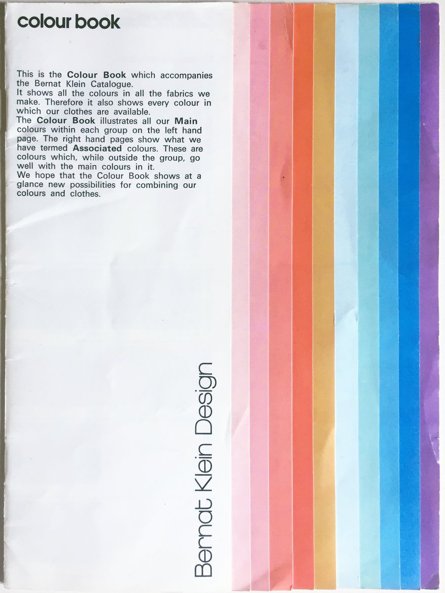
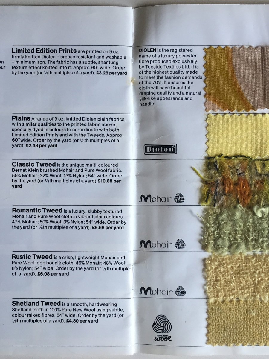
Colour Books accompanied the Bernat Klein catalogues to show how the fabric range could be matched in colour and contrasted in texture, the last page carrying fabric swatches.
An example of a colour book with fabric samples, Richard Brook
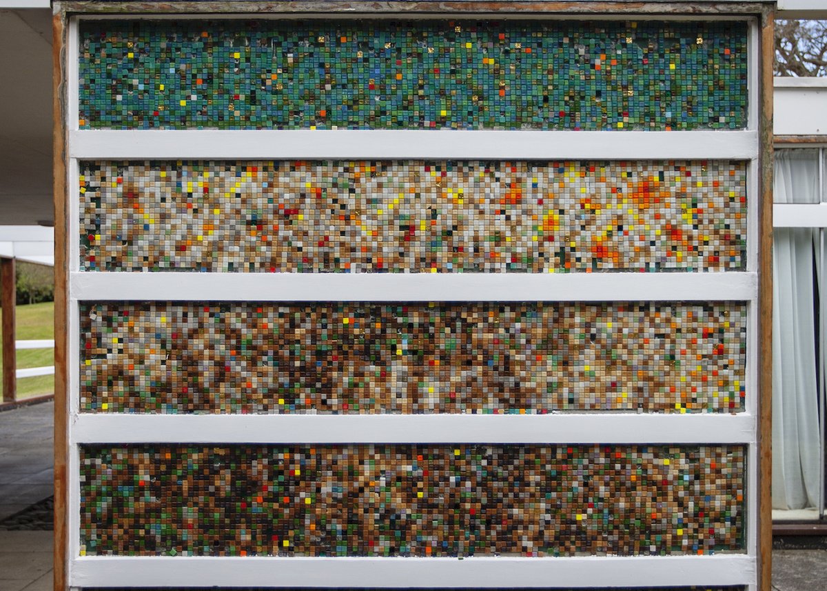
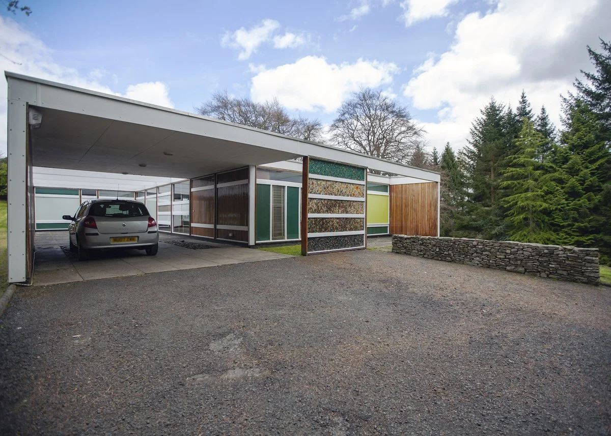
The colours of the landscape were referenced in Bernat’s design for the mosaic screen that faces those arriving at the house up the rising curve of the drive. The greens, reds, oranges, browns and greys of the variously textured and glazed tiles capture the seasonal transformation of the deciduous woodland and the rolling vales of the Borders. The myriad colours recall Bernat’s ambition to create cloth with ‘dozens and dozens of them’.
This replaced Peter’s original screen, which was a glass sandwich panel, with a random pattern made from the same fibre-board as the solid spandrel panels on the rest of the house. I am reliably informed that an incident with a car in the late 1980s led to the replacement artwork!
Bernat Klein’s mosaic panel at the entrance to High Sunderland, Richard Brook, 2012
Car port, mosaic screen and terrace to master bedroom, Richard Brook, 2012
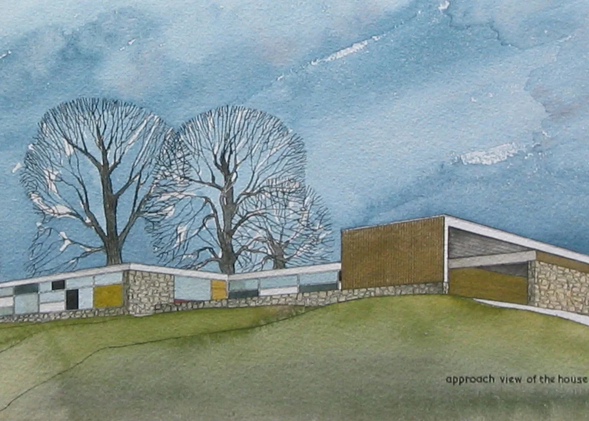
Gentle contours cross the site and the datum at which the house is set, nestled amongst the rolls of the prow, rising from the confluence of two rivers. It doesn’t have a commanding presence over the valley, rather its low horizontal profile sits amidst the landscape attenuated by a ha-ha to the south and mature trees to the north. A flat roof performs as Peter intended - to ‘help tie the house down more successfully into its particular landscape’. [Womersley, P. ‘5 Houses’, Architectural Prospect, Winter 1958, p.17.]
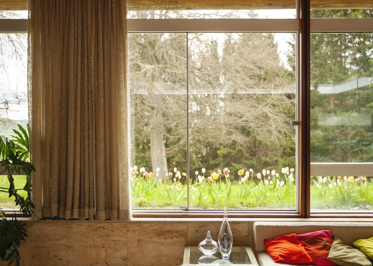
From the inside, the views down to Ettrick Water, a tributary of the Tweed, are composed and controlled by the grid and orientation of the house. The frame both supports the building and surrounds the vistas. It is impossible not to feel part of the outside when you are inside High Sunderland.
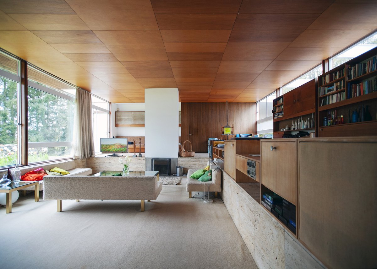
View across living area, Richard Brook, 2012
Such sensations were quite typical of this period of Peter’s practice which Joe Blackburn described as a ‘taut modular discipline’ with ‘interflowing external and internal space’.
This sense of the blurring of interior and exterior was encountered by journalist Anthony Welton in 1966 who ‘had the feeling [he] was under an umbrella out-of-doors rather than in a building. It was exhilarating.’
Bernat Klein painted and drew from the Borders more than he had imagined he might and lived the seasons through his appreciation of their colours. Even on a dull day the colour and light, and the way they are attenuated by the house, are immeasurably imbibed and affect the mood of the interior - Peter specified glazing with alternative transmission rates dependent on the orientation of each window. Bernat’s paintings were experiments in colour and texture and this thinking translated into his textile design. In this way the house, the countryside and the cloth were interwoven with one another – Peter made a space that enabled such synthesis.
View from the dining room to the south-east courtyard and beyond, Richard Brook, 2012
From the outside, the house could be read as so uncompromising that it is anti-contextual. Espousing a personal view in the AJ, Michael Laird felt that it had a ‘slightly foreign fragile quality’ and that there was an absence of ‘stoicism’. He referred to the dry stone walling of the formal landscaping as ‘oddly self-conscious gestures to native tradition’. Peter’s early iterations of the scheme included the use of local stone for the walls, but this was dropped to make savings and replaced by fibreboard panels. [Wickens, M. (2005) The Modern House in Bath: Peter Womersley's Valley Spring (Masters dissertation: Bath) p.37.]
The solid colours of the panels – black, dark green, yellow and two light browns – were a clear accession to context. Laird’s other criticism was over the unsheltered walk between the covered car port and the front door – the earlier scheme had a separate garage as well. Nonetheless, the spartan frame with its bold, block colours, timber linings and transparency feels very much a part of its landscape and its enduring discourse with its site is enhanced by the universal elements of its construction. Matthew Wickens, in his excellent dissertation on Peter Womersley’s Valley Springs (1966-68), points to the influence of Marcel Breuer in High Sunderland, specifically Breuer’s own house (1938-39) and schemes published in his 1955 book, Sun and Shadow: The Philosophy of an Architect.
Peter himself referred to North American precedents when discussing his houses and their Miesian qualities. From reading what little Peter wrote of his own work it is clear that he also associated the houses with one another in terms of their planning, organisation and construction. By 1969 he was bold enough to state as much when speaking at the RIBA – ‘Should not every building be a fresh rebuilding of experience gained on other buildings?’ [Womersley, P. ‘Architects’ approach to architecture’, RIBA Journal, May 1969, pp.189-196.]
Each one of Peter’s houses had a particular circumstance that yielded a lesson and certain solutions learnt were then applied to another house. His motifs included using a change of level to demarcate space; fixed furniture to act as room divider; minimising circulation space; and extending buildings into the landscape by screen or dwarf walls – all of these were at play in High Sunderland.
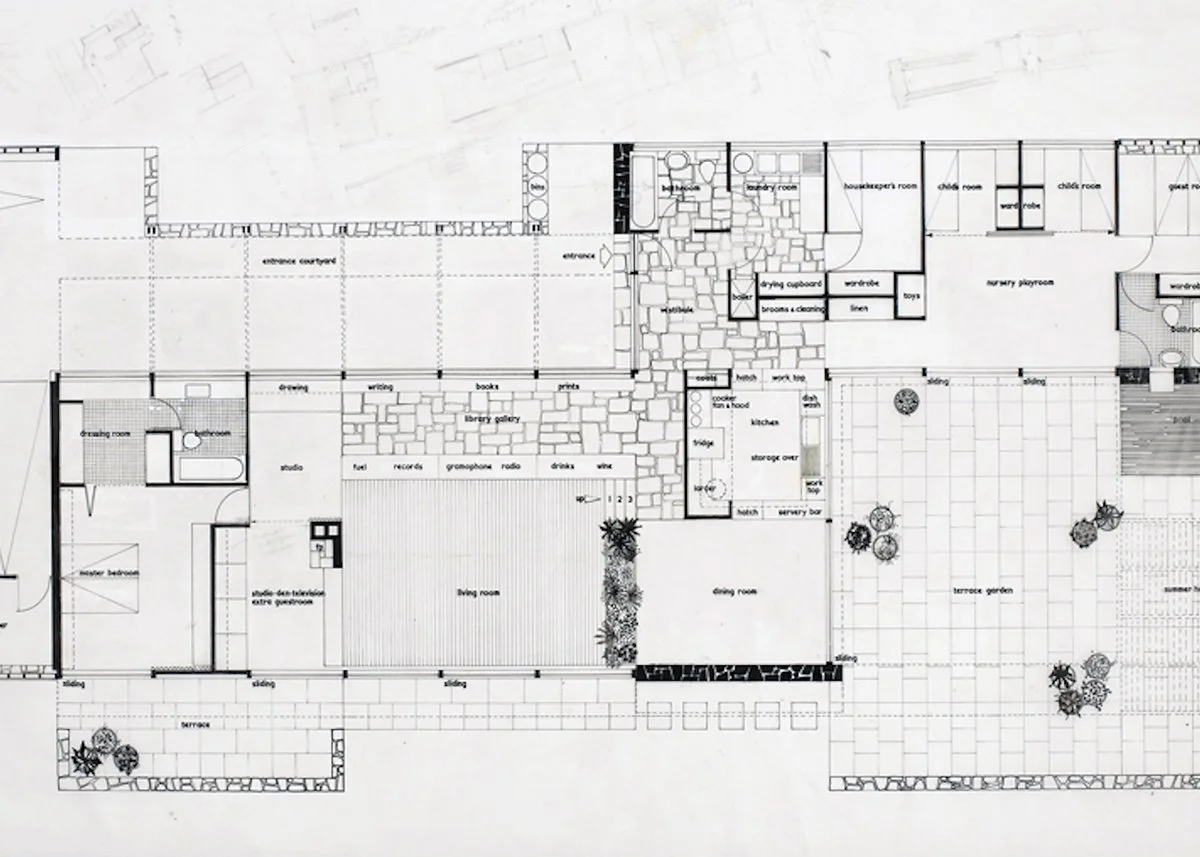
An early plan of High Sunderland, which shows the ‘C’ profile of some stone walls that re-emerge in Womersley’s designs for structural brick bays in later houses, Lyon & Turnbull, Edinburgh
Perspective sketch of High Sunderland © Peter Womersley. Photograph by Matthew Wickens and reproduced by kind permission of Shelley Klein
In constructional terms, High Sunderland is relatively simple. A prefabricated makore timber frame on an 8ft grid sits atop a concrete raft foundation. Peter used grids as an organising device in all his houses, he testified to planning in this way stating that it permitted ‘the interior and the exterior of the house to ‘read’ together’. The open plan enabled by such an approach was referred to by Peter as ‘circular planning’. In this case, it was more pivotal planning, as the kitchen and other service areas effectively split the house into two with the parents’ bedroom and living areas to the west and children’s bedrooms and play area to the east. The frame occupied the entire concrete apron, but the interior of the house did not. An open double garage, two courtyards and a terrace punctuated the grid, optimised the daylight conditions and emphasised the relationship between interior and exterior. The house was altered in the 1980s and what had been external space, under cover was enclosed to form a studio space. This was made possible by the construction system and described by the Kleins as ‘most adaptable’.
High Sunderland, Richard Brook, 2012
In order to define the interior spaces, the major device was the sunken living area, set 2ft lower than the rest of the house. Peter’s own house, The Rig, had a similarly disposed sitting room, though not on the scale of High Sunderland. To the dining area, a wall of plants rising from a fixed planter made the division between spaces. The other sides were demarcated by a fireplace and a home entertainment and storage system. The space around the living area functioned as library, studio and reading room and was still used by Bernat for painting when we visited in 2012.
Living Space, Richard Brook, 2012
Peter wanted to design as much of the fitted furniture as possible, not just for its spatial utility, but to ‘extend the architecture of the house internally’ and to eliminate the need for ‘cabinets, chests of drawers and side-boards’. Where all of the fixed furniture was designed by Peter, all the curtains and upholstery were specially designed and manufactured by Bernat. The fabric brought colour to the largely neutral background of the house. Most finishes were raw – Peter’s response to what he saw as an overzealous use of colour in contemporary interiors. His view was that: ‘Colour – strong colour – can more logically and easily be provided in fabrics, rugs, upholstery, and against a background of neutral white and natural materials – timber and brick – each colour has its proper value and the lines of structure and furniture read.’ Colour and form worked harmoniously and were a form of conversation between client and architect, despite Bernat’s assertion that the design was all Peter’s.
That the house is a result of this association is clear, though there is nought to suggest collaboration in the fullest sense. Regardless, the conviction that both Peter and Bernat had in good, modern design, was the latent force in its realisation. Bernat’s idea of design was ‘to enjoy the exploration of new possibilities’ and ‘to take pleasure in finding new solutions to old problems’ [Klein, B. (1976) Design Matters (London: Secker & Warburg) p.3.] and for Peter, echoing Denys Lasdun’s rhetoric, every new building ought to be a ‘one-off’. High Sunderland is increasingly less obscure, but its architectural quality is no less enduring.
South-east view of High Sunderland, Richard Brook, 2012
Richard Brook's research is mostly concerned with post-war British architecture, landscape, infrastructure and urbanism. He is especially interested in modern architecture of the regions and of the state. He acts as an Advisor to the Modernist Society and is an active member of the Twentieth Century Society.
He is currently completing a book on the renewal of post-war Manchester, as well as directing a research project about the landscapes of post-war infrastructure. Richard shares his fieldwork photography on Instagram @mainstream_modern


